

By Renée Tillotson
My family did something remarkable last week.
They took a project of mine, basically tore it to shreds (Ouch!), then helped me to recreate it. I wonder what you’ll think of the end result by the time we were finished with it…
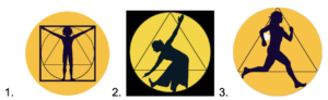
Let me begin by saying that a company’s logo is meant to convey something of the soul of that company. When we created our logo for the Academy of Mindful Movement back in 2021, we thought of Da Vinci’s Vitruvian man. This Renaissance image harkens back to ancient ideas of balance and proportion, and the sacred geometry of the human form.
As an outgrowth of Still & Moving Center, the Academy gives online training to instructors and coaches of all different movement practices worldwide to teach their movers mindfully. Tuning into our inbuilt instruction manual – the body’s sensations – tells us how the body wants to be moved. As the Da Vinci drawing suggests, the human body deserves our honor, respect, and care.
So, for the Academy of Mindful Movement’s logo, we did our best to create a Da Vinci person – neither male nor female, with the sacred geometry of the circle, triangle and square.
![]()
That logo served the Academy well. In March 2024 we graduated our 5th cohort of trainees with that logo.
Now we are preparing for the Academy to enter the world stage at the enormous IDEA fitness convention in Los Angeles. Before creating our booth’s banner, brochures, name tags and swag (goodies to hand out to conference attendees), we thought we should reconsider our logo.
Is it appealing? Does it represent us, with all the joy and spontaneity that we want to instill into our Mindful Movement trainees? A gladiator mentality still seems to pervade the modern world of sports and performance arts. The more the athletes and performers put their safety at risk, the higher they boost their audience appeal with not just the “thrill of victory” but also the “agony of defeat”. Does our logo convey a celebration of the amazing human body in motion?
Does our logo even suggest MOVEMENT? Not so much.
The Academy staff decided to go back to the drawing board.
I was doing photo shoots for the book I’m in the process of editing for publication. In one of the shoots, we came up with a photo that seemed as if it might work well for a new image in our Academy logo.
So we gave it a try, and this is what my graphic artists and I came up with:
![]()
This logo idea features a pose that’s fairly ambiguous: it’s not really yoga, it’s not quite martial arts, it’s not traditional dancing… so that’s good! The Academy is for instructors from ALL the moving arts. It’s got the proportions of the circle, the triangle, and the square, with the suggestion of Da Vinci’s Vitruvian Man. The only problem: It’s definitely a Woman!
 At this point, I decided to take a straw pole of my extended family to see what they thought of the new logo idea. We have a 20-person strong text thread of three generations of family members, many of whom are athletes, yoga practitioners, and dance lovers. We mostly share photos of vacations and congratulations on birthdays, engagements, anniversaries, etc.
I was entering new territory asking them for feedback on a company logo. Nobody in the family had ever asked on the thread for professional advice of this kind. I had no idea how huge their response was going to be.
Responses started to flow in. One daughter-in-love (a distance runner) liked the circle. One of my brothers (a recreational walker) and my son-in-love (a disc golfer) both liked seeing my image in the logo. Sweet of them.
I pushed the whole family with the question: “Will an image of me – obviously female – cause the Academy to lose the interest of the MALE coaches and instructors?”
One of our LGBTQ+ family members suggested going back to a more gender-neutral image. And I thought it was also important to get a movement-neutral image. How about a gender-neutral figure running? Running is a universal human movement, right?
We took a stock image of a running athlete and our designers came up with this potential logo:
![]()
I was pretty pleased with it. It was so androgenous, and finally the Da Vinci person was in motion, which we never succeeded in achieving in our original logo.
Nope. My family pretty much hated it.
From the female side: “It definitely looks like a male figure.”
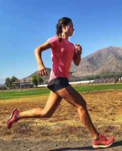 Actually, it came from this photo of a running woman. Success, right?
Not yet! From my mom (a recreational swimmer): “Running doesn’t seem to go with mindful movement although I know it’s also related.”
From my other brother (a distance biker): “A less specific movement silhouette than running might be better…a playful image, a movement without a specific purpose. I like the one of you better that way. I don’t think the gender of the silhouette is important.”
From our daughter (a yogi): “The runner looks too disciplined and serious to me, and single-sport oriented. I know you love the symbolism of the geometric shapes and colors, but it looks too institutional, and not very modern. Kind of overly philosophical.”
That’s when the family really started to get creative, taking the logo into a whole new direction:
From another daughter-in-love (a gym attendee):
![]()
Boy, did my family go crazy for that image when it showed up on the text thread! Lots of emoji hearts! ❤️💙💛 “This is so great!” exclaimed one of my nieces (a former water polo player) of the colorful leaping dancer.
“I agree completely,” chimed in my other niece (a skier).
From husband Cliff (a paddler): “This is COOL!!!!!”
Again from our daughter, Sandhya, who attended some of our Academy sessions: “Yes! This joyful image feels much more in line with the feel I get from your Nia movement classes and Academy lessons.”
Wow! That family-suggested image burst all the boundaries of what I thought our logo was about. No Da Vinci person. No sacred geometry. Yikes! 😬 This family input was starting to make me feel nervous. What kind of chaos had I invited into our design process?
Was I losing all control here?!?
“Just put a circle around it?!” suggested our older son (the firefighter uber-athlete).
OK, well that comment indicated some recognition of our original design. “Calm down,” I internally coached myself. “Let’s just stay loose and open and see where this logo goes.”
I texted back to my fam: “Awwh! 🥹 You all love me so much! And you know me pretty well, too! I used a similar image style that I purchased for a workbook I put together a few years ago.”![]()
Daughter Sandhya responded immediately: “That’s it! Joyful, gender neutral, simple, and filled with light!”
I protested: “For the Academy of Mindful Movement my ultimate target audience is coaches and instructors who are not like me. I want to change the “No pain, no gain” ethos of bullying and shaming people to misuse their bodies in CrossFit-type gyms.”
One brother wrote back: “I do like the athleticism and precision of the movement captured in the multi-colored image that DD sent, given your mindful movement core tenets.”
Still protesting, I texted: “I want the Academy to be noticed by a personal trainer that our sons might train with. What kind of image for the Academy will we need for that?”
I decided to call for a new vote on the three options our designers had come up with
4.![]()
with a circle around it. They almost unanimously voted for 4.
Now what was I going to do? I REALLY did not think that such a feminine-looking image was appropriate for the Academy. Had I boxed myself into a corner I couldn’t get out of?
No – wait! At 90 years old, Mom (Nana) is still willing to think outside the box – or actually back into the round. “Your image from the other book is joyous, not gender specific, and could be in a circle with your blue and go!”
Sandhya agrees and makes the winning suggestion: “I agree with Nana. Here’s a quick mock-up of #5 with my very basic graphic design skills. The #5 looks cleaner, and also kind of like an Om symbol.”
![]()
YESSSS! I am vastly relieved by Sandhya’s suggestion. I can take that idea to our graphics team and run with it. I text back to everyone:
“I have an amazing family. I’m blown away! We can run with this idea. 💛🤗🤩🤗💛”
With Sarah Hodges taking the lead, our design team goes into action with their advanced graphic arts skills. Within a few hours we get back to the home team with our “solar leap” logo. Here it is:
I’m greeted by a shower of enthusiastic responses:
“That’s amazing 🤩”
“LOVE it! I like how it flows outside the circle and the color gradients.” 👍👍👍👍👍
“I love how the figure emanates from the sun, moving onward. Amazing how fast this creative process evolved and what it yielded.”
From traveling niece in Bali: “It was fun to wake up to this creative discourse 🙂 wonderful ideas and an awesome outcome, love it.” 💙
From DD, original contributor of the colorful abstract figure that busted open our creative process: “Looks so good! It feels more fluid!”
Meanwhile, our Academy staff texted in their appreciation for the new logo.
And a final, insightful comment – one that really struck home for me – from my brother who worked decades in the tech industry: “Well, this is a new one. I’ve never seen a group text focus group before.”
Indeed, I believe we pioneered a new business-family feedback loop model. I managed to keep a guiding hand for branding continuity, yet was somehow able to let my family and staff know how much their input meant to me, so it kept flowing in through the open door.
I feel enormously satisfied with both the end result and the process by which we got there.
Here’s my final text: “🥰 Mahalo to all of you! You definitely helped to give birth to this new logo, and I love it. All your energy is woven into it. 🥰”
![]()

Renée Tillotson
Renée Tillotson, Director, founded Still & Moving Center to share mindful movement arts from around the globe. Her inspiration comes from the Joy and moving meditation she experiences in the practice of Nia, and from the lifelong learning she’s gained at the Institute of World Culture in Santa Barbara, California. Engaged in a life-long spiritual quest, Renée assembles the Still & Moving Center Almanac each year, filled with inspirational quotes by everyone from the Dalai Lama to Dolly Parton. Still & Moving Center aspires to serve the community, support the Earth and its creatures, and always be filled with laughter and friendship!
Get the Still & Moving App
This post is also available in: English (英語)